BURN
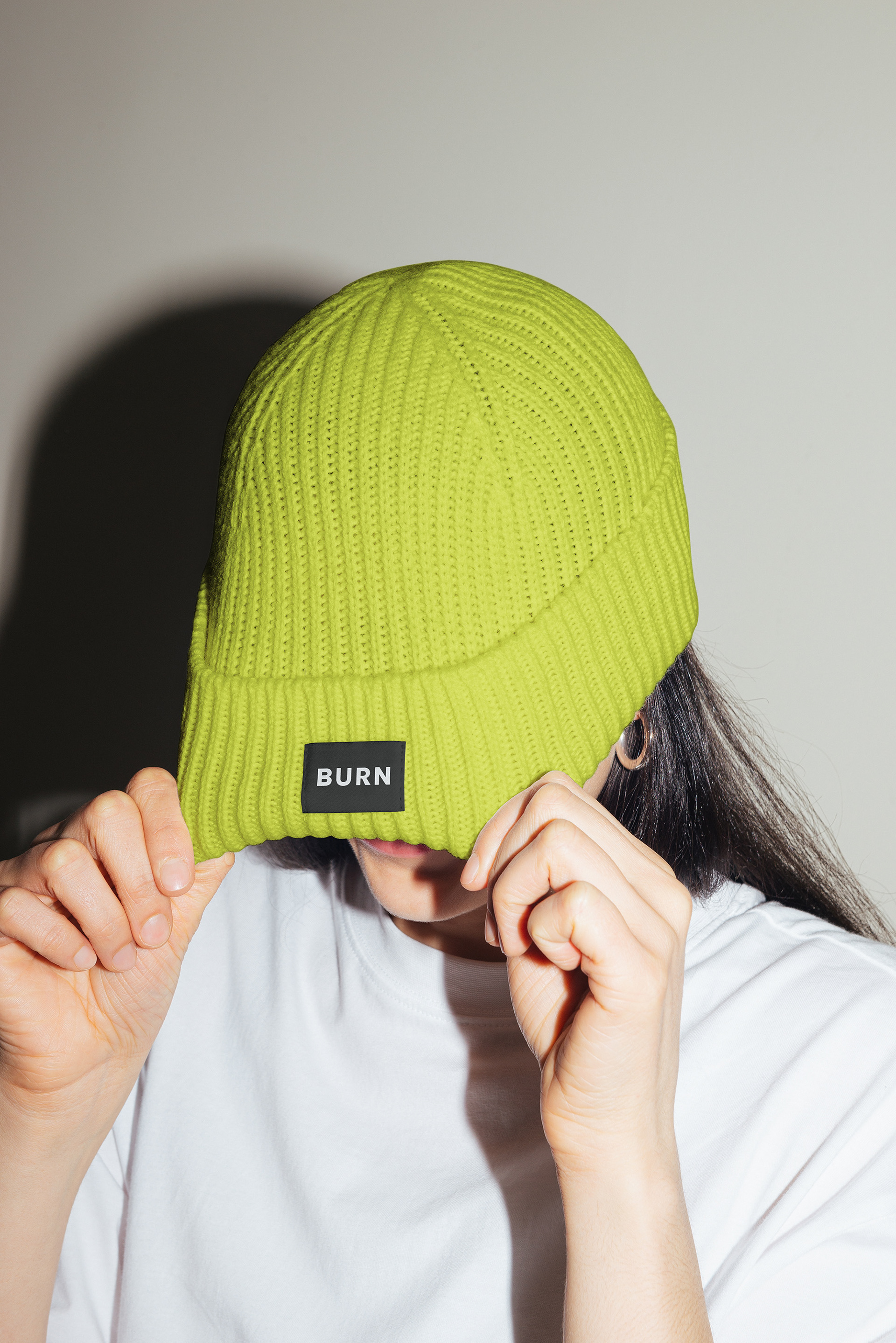
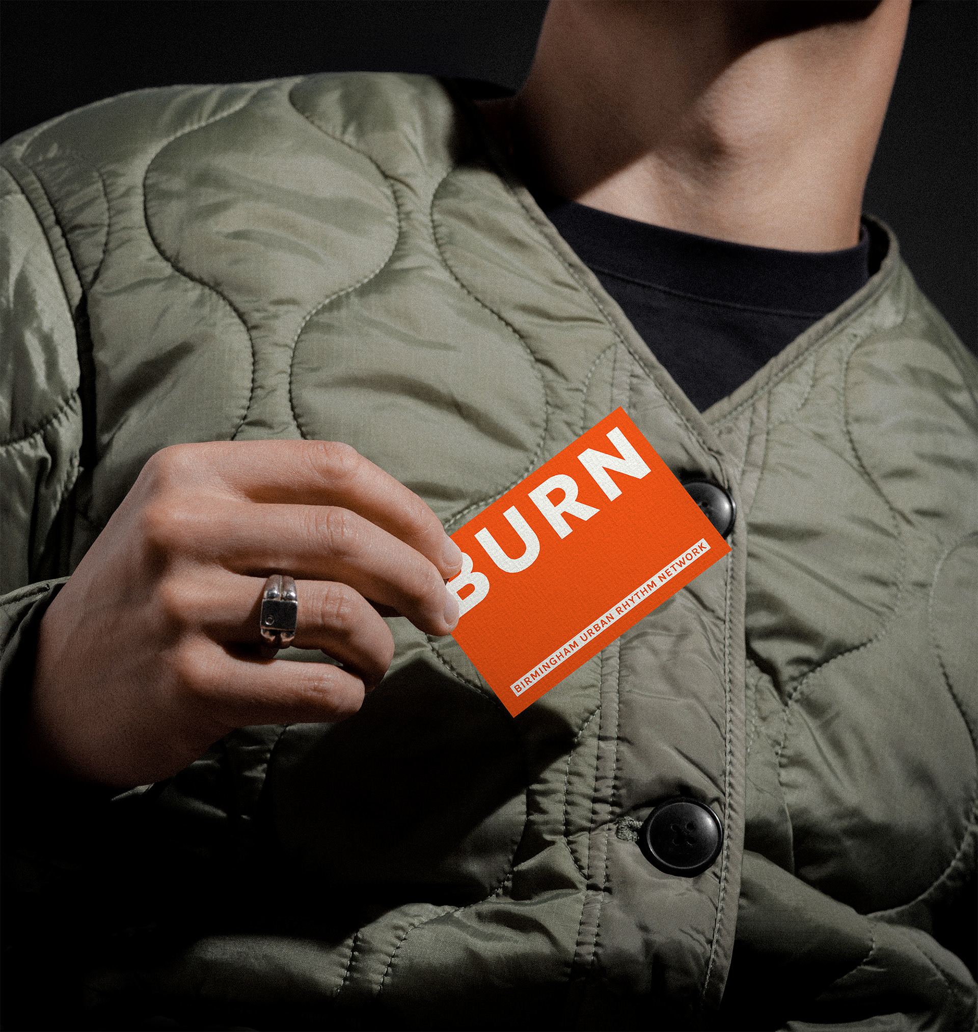
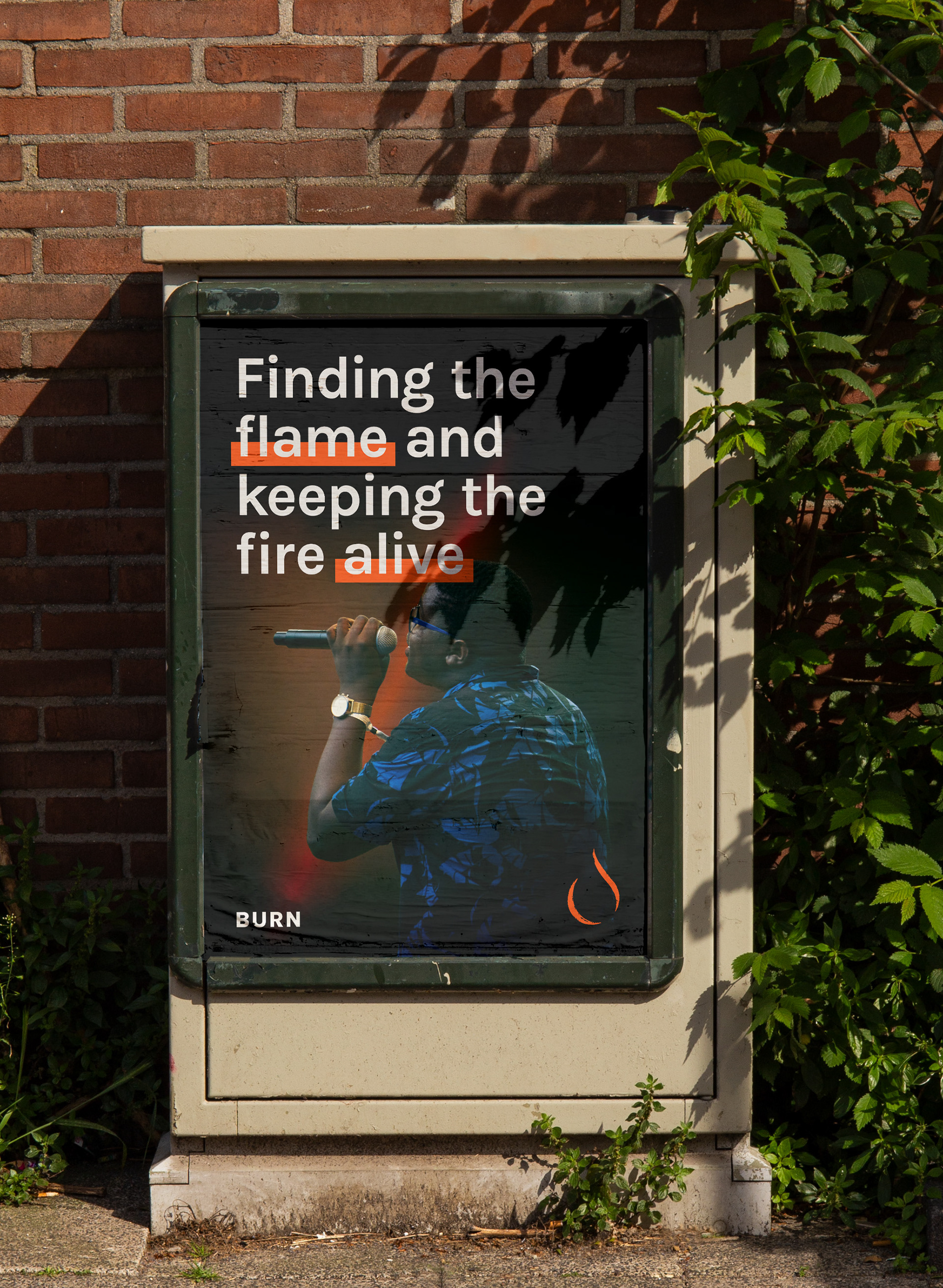
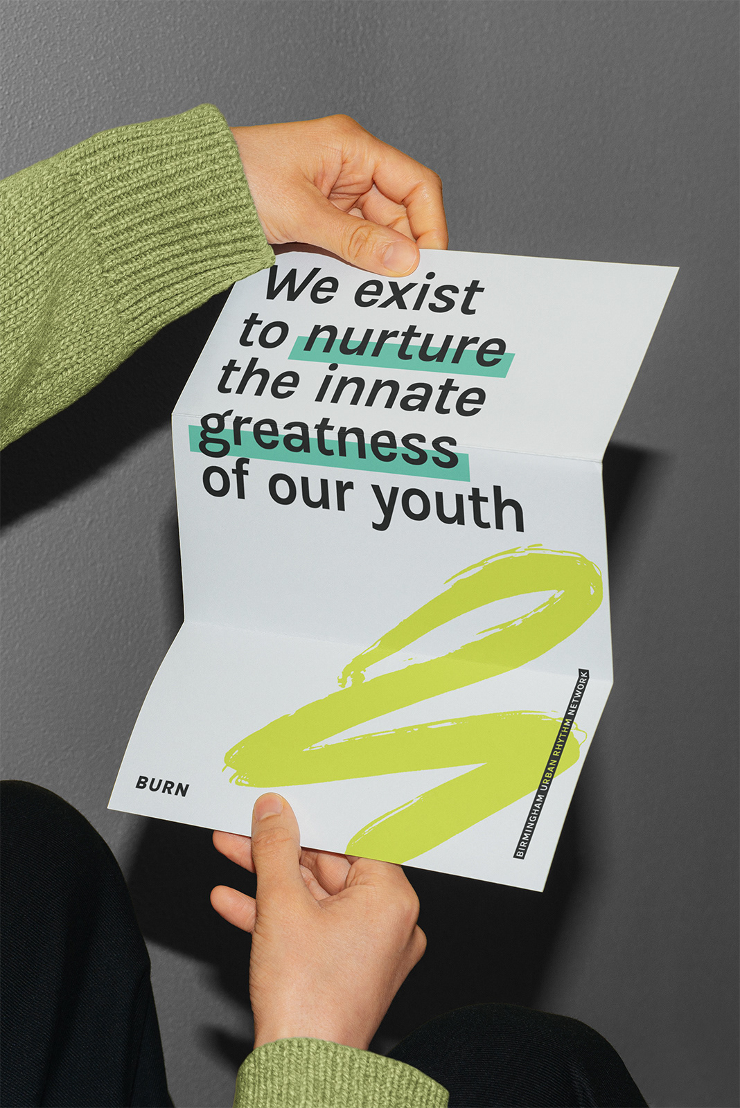
BURN (Birmingham Urban Rhythm Network) is a charitable youth organisation advocating for the safety, opportunity and betterment of young people through the lens of music, music production and talent nurturing. Their work extends into the community through career development initiatives, educational workshops and mentoring.
In collaboration with the team at crave. we developed a versatile identity that is both minimal and layered. With this approach, we could ensure that the identity was evolving to suit the needs of the brand; to engage young adults and to be effective in more formal settings. The brand elements needed to speak to the purpose and DNA of BURN. Creating a central brandmark alongside a suite of icons meant that we were able to bring those core values to the forefront and balance the 'stripped back' with the playful.
Client: BURN
Brand Studio: crave.
Contributions: Logo Design & Visual Identity


